Portfolio Analyst
The Portfolio Analyst builds on the Breakdown Analysis tool and provides you with more options to help you analyze your data. This tool is particularly beneficial if you are managing efficiency projects or large building portfolios.
Click on the briefcase icon in the toolbar.

Breakdown
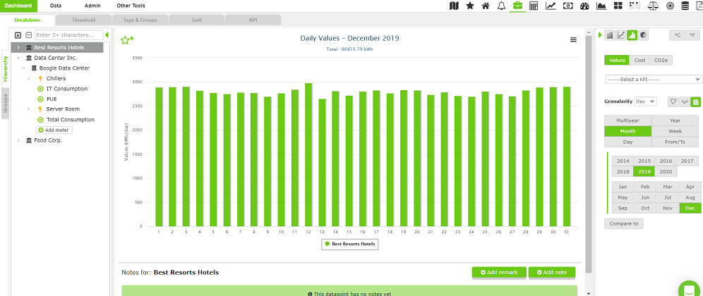
The tree on the left shows all your data points. You can select one or more data points to compare the use and costs of multiple locations. Use the Control panel on the right to adjust the granularity, time period, and data visualization preference.
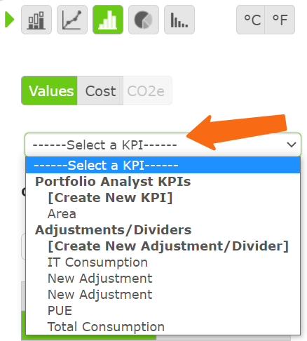
You can also check how multiple sites are performing against KPIs and thresholds. These charts can be saved to your Home page or download the data behind the chart, or the chart itself.
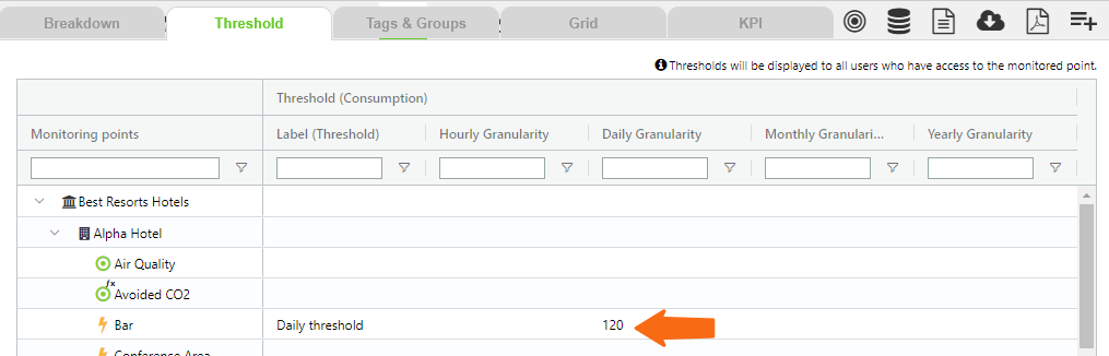
Thresholds
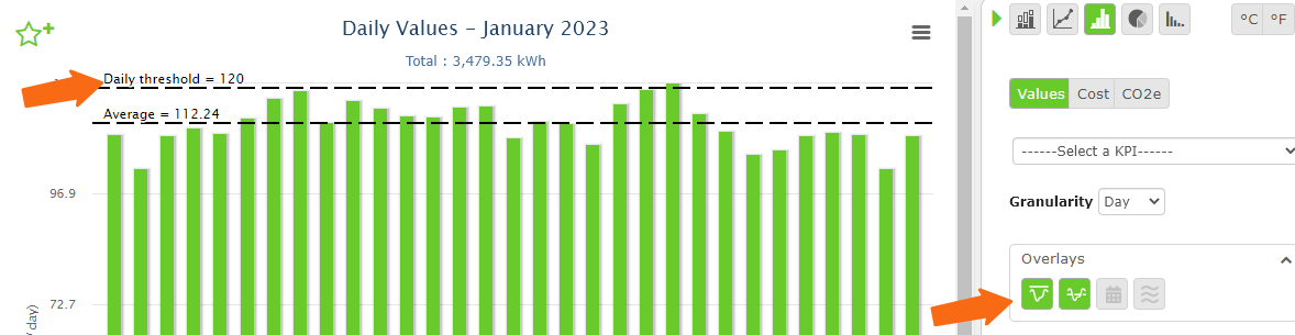
On this tab, you can set hourly, daily, or monthly thresholds so you can easily see if a data point is consuming energy above the limit.
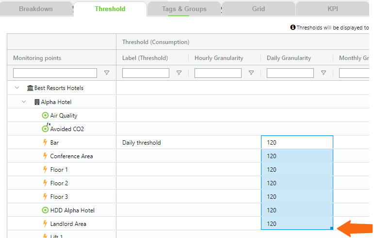
You can manually enter values or double-click and drag to copy the contents across data points.
View thresholds in the Breakdown
You can see the thresholds in the breakdown by using the Overlays in the Control panel.
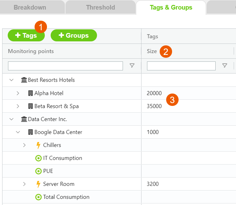
Tags
Tags let you add additional information to objects in your tree.
Create a tag
- Create the Tag.
- Find the column you created.
- Add the information to the objects.
Search for tagged objects
Filter for a tag on the Tags and Groups page or search for tagged objects on the Breakdown page.
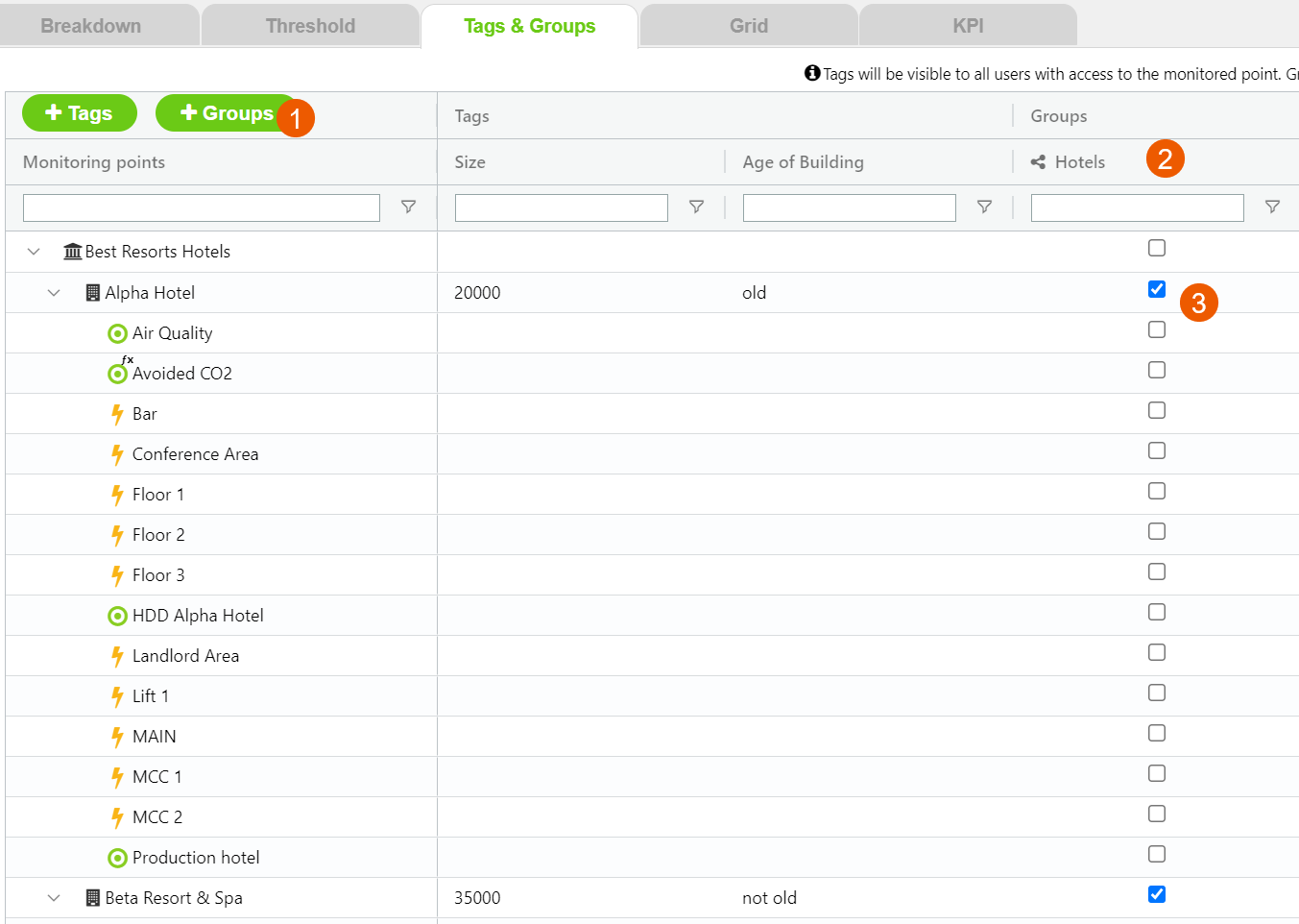
Groups
Select the objects you want to include in your group and then view them on the Breakdown page.
Create a group
- Create the Group.
- Find the column you created.
- Choose the objects to include in your group.
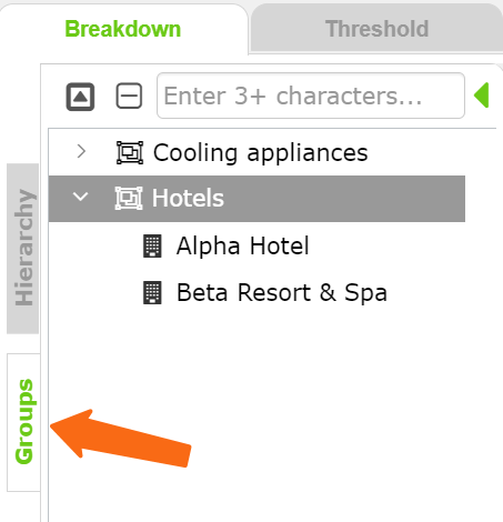
View a group
On the Breakdown page, you can view your group.
Groups let you aggregate similar data points, create shortcuts to have important information available to be recalled on demand, and have aggregated figures on data points that belong to different organizations or sites.
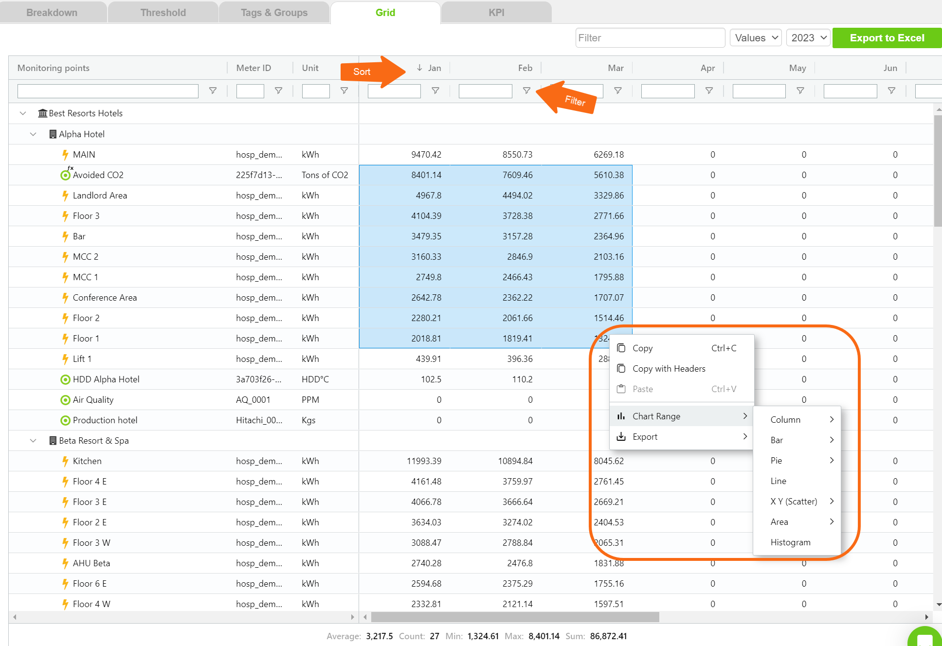
Grid
The Grid tab displays monthly use and cost data similar to a spreadsheet.
- You can filter and sort each column.
- Copy data.
- Create a chart from selected data.
This feature helps with the management of multi-tenant buildings or portfolios of sites as it lets you have monthly figures all on one page, great for bill validation and use and cost allocation.
Key Performance Indicators
The KPI tab lets you create customized energy performance indicators and apply them across sites and buildings to benchmark and analyze performance.
On the KPI tab, click +KPI to open the form.
Set normalization or conversion factors to apply to your monitored data points for benchmarking or to evaluate performance metrics.
Some very common use cases for normalizations are the evaluation of energy consumption per floor area (m2 or sqft), degree days, and units produced, among others.
Conversion factors can turn your consumption figures into GHG emissions, aid with unit conversions (for example, gas usage in kWh instead of Sm3 or vice versa), and so on.
Example
Create a KPI to evaluate the normalized energy consumption per square meter across the different floors of a hotel building.
Add a divider.
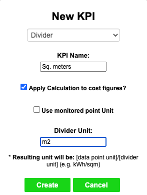
When it makes sense, you can choose to apply the divider to cost figures. This gives you visibility on the cost per square meter in addition to the normalized consumption figure.
You can also choose if you want to take the divider unit directly from the data point, which comes in handy when the multiplier/divider is another data point (like degree days) rather than a static factor, or if you want to input it manually like in this initial example.
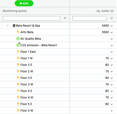
Enter normalization factors
After you save, a new column appears on the KPI table where you can enter the normalization factors. You can double-click a cell to type in the value or click the arrow on the right-hand side of the cell to select a point from your menu tree.
Apply a KPI
- Select your data points, sites, or organizations.
- Use the Control panel Select a KPI option.
- The KPI drop-down only shows the KPIs that are available for the items you selected.