Report-31
Last updated April 30, 2026
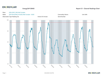
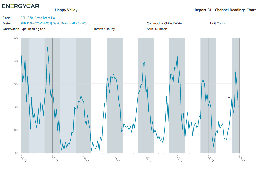
Channel Readings Chart
This graph displays hourly or more frequent interval data over a date range of up to 35 days.
Key features
-
Visualize trends in building or meter data.
-
Quickly spot issues like:
- Setback hour problems
- Usage spikes
- Unusual equipment cycling
Customization options
- Group meters in different ways for comparison.
- Highlight weekends and nights for better visibility of off-hour activity.
Use case
Ideal for identifying patterns or anomalies in energy use across meters or time periods.
Report-31 is available as: PDF, Excel, Word
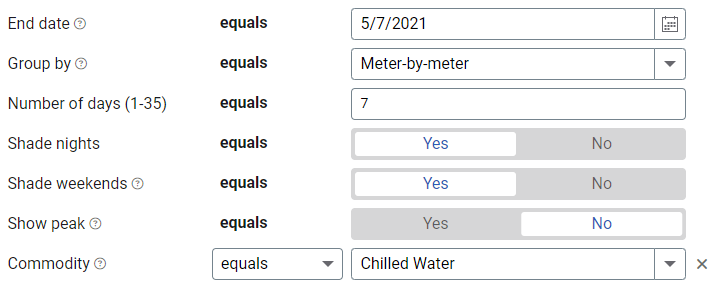
Set your filters for Report-31
- Set your Ending date.
- Decide how to Group by.
- Enter the Number of days.
- Shade nights. Shading helps you interpret the meter readings.
- Shade weekends.
- Show peak adds a red line to let you see the highest reading.
- To limit the report to a subset of data, set a filter such as Topmost place, Site Group, or Commodity.
Available filters for Report-31
Required filters
- End date - Set the end date for the report.
- Group by - Decide how you want to group your report: aggregate like meters, meter-by-meter, overlay like meters.
- Number of days (1-35) - Enter the number of days to include in the report.
- Shade nights - Shading helps you interpret the meter readings. Night is shaded from 6 pm to 6 am.
- Shade weekends - Shading helps you to interpret meter readings.
- Show peak - Adds a line across the chart with the peak value.
Recommended filters
- Channel code - Filter your report to one or more meter channel codes. Not compatible with other filters such as topmost or groups.
- Commodity - Select one or more commodities for the report. This filter is not compatible with commodity category.
- Commodity category - Select one or more commodity categories. This filter is not compatible with commodity.
- Meter group - Filter for specific groups. To include all group members, do not set a topmost filter. TIP: You can combine with other filters if you want to refine your results.
- Topmost place code - Select the topmost organization or site you want to be included. When you set a topmost organization or site it is the highest level of the facilities tree used, this lets you select a subset of data from your tree for reporting.
- Topmost place name - Select the topmost organization or site you want to be included. When you set a topmost organization or site it is the highest level of the facilities tree used, this lets you select a subset of data from your tree for reporting.
Optional Filters
- Meter code - Filter to one or more meters. Not compatible with topmost filters.
- Meter name - Filter to one or more meters. Not compatible with topmost filters.
- Meter serial number - Filter by one or more meters. To include all results do not set a topmost, group, or other filters.
- Meters in site code - Filter to include meters directly under one or more sites. TIP: To see all the meters at a certain level in your hierarchy use the Topmost place filter. This filter is not compatible with other topmost or group filters.
- Meters in site name - Filter to include meters directly under one or more sites. TIP: To see all the meters at a certain level in your hierarchy use the Topmost place filter. This filter is not compatible with other topmost or group filters.